Category: How To Style

  • How to Design a Home with Natural Light

    How to Design a Home with Natural Light

    How to Design Harnessing the power of the sun to illuminate and warm our homes is more than just a design choice; it’s a fundamental principle of sustainable and healthy living. The strategic use of natural light significantly impacts our mood, energy consumption, and overall well-being. This exploration delves into the science and art of designing homes that bathe in sunlight, from understanding the nuances of direct, indirect, and diffused light to mastering architectural techniques and interior design strategies that maximize its benefits.

    We will examine how window placement, size, and type dramatically affect the amount and quality of light entering a space. We’ll discuss the crucial role of light-reflective materials, the clever use of mirrors, and the impact of color palettes on perceived brightness. Furthermore, we will explore architectural elements like skylights and atriums, and how building orientation and landscaping contribute to optimal natural illumination.

    By the end, you will possess a comprehensive understanding of how to design a home that is not only aesthetically pleasing but also vibrantly alive with the energy of natural light.

    Understanding Natural Light in Home Design

    Light natural architecture house japanese interiors ma style architects walls minimalist interior japan study nook beautiful designing ceiling without inside

    Natural light is far more than just illumination; it’s a fundamental element shaping the ambiance, health, and energy efficiency of a home. Its impact on interior design extends beyond aesthetics, influencing our mood, productivity, and even our sleep cycles. Understanding how to harness and optimize natural light is crucial for creating comfortable and sustainable living spaces.

    The Importance of Natural Light in Interior Design

    Exposure to natural light is intrinsically linked to human well-being. Studies have shown a strong correlation between adequate daylight exposure and improved mood, reduced stress levels, and enhanced sleep quality. Beyond the psychological benefits, natural light significantly reduces the need for artificial lighting, leading to lower energy consumption and a smaller carbon footprint. Moreover, natural light enhances the perception of space, making rooms feel larger and more inviting than they might otherwise appear under solely artificial illumination.

    The quality of natural light also impacts color perception, allowing for more accurate and vibrant color rendering within the interior.

    Types of Natural Light

    Natural light is not uniform; it varies in intensity, direction, and color temperature depending on its source and the time of day. Direct sunlight, characterized by its high intensity and concentrated beams, offers the brightest illumination but can also create harsh shadows and glare. Indirect sunlight, which reaches the interior after being reflected or diffused by surfaces like clouds or trees, provides softer, more even illumination.

    Diffused light, often experienced on overcast days or through translucent materials, offers a gentle, even light source that minimizes harsh contrasts. The interplay of these three types dictates the overall lighting character of a space.

    Impact of Window Placement and Size on Natural Light

    The strategic placement and size of windows are paramount in maximizing natural light. South-facing windows (in the Northern Hemisphere) receive the most direct sunlight throughout the day, while east-facing windows offer bright morning light and west-facing windows provide warm afternoon light. Larger windows naturally admit more light, but their positioning is equally crucial. For instance, a large window positioned to face a shaded area will yield less light than a smaller window with optimal sun exposure.

    Window placement also dictates the direction and intensity of light within a room, impacting the design and arrangement of furniture.

    Maximizing Natural Light in Various Room Types

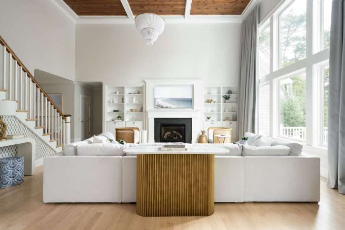
    The approach to maximizing natural light varies depending on the room’s function and its orientation within the house. In a living room, large windows or a combination of windows and skylights can create a bright and airy atmosphere. Strategically placed mirrors can further enhance light distribution, reflecting sunlight into darker corners. In a kitchen, strategically placed windows near the work areas can illuminate food preparation areas, enhancing visibility and reducing the need for artificial lighting.

    In bedrooms, light-colored walls and curtains that allow light to filter through can create a calm and relaxing environment. Bathrooms, often smaller and less naturally lit, can benefit from frosted glass windows or skylights to maximize privacy while still admitting natural light. In all cases, minimizing obstructions to windows is crucial to maximizing light penetration.

    Optimizing Window Placement and Design

    Harnessing natural light effectively requires a strategic approach to window placement and design. The orientation of your home, the size and shape of your windows, and the type of glazing all play a crucial role in determining how much sunlight enters your living spaces and at what times of the day. Careful consideration of these factors can significantly reduce your reliance on artificial lighting, lowering energy bills and improving your overall well-being.

    Optimal Sunlight Throughout the Day

    The sun’s path across the sky dictates the amount and direction of sunlight that falls on your home throughout the day. In the Northern Hemisphere, south-facing windows receive the most direct sunlight year-round. East-facing windows are ideal for capturing the morning sun, while west-facing windows bathe rooms in the warm light of the afternoon and evening. North-facing windows, while receiving less direct sunlight, provide a consistent, softer light throughout the day.

    By strategically placing windows on different sides of your home, you can ensure a balanced distribution of natural light, maximizing its benefits in various rooms and at different times. For example, a kitchen might benefit from east-facing windows for morning sunlight during breakfast preparation, while a living room might prefer south-facing windows for maximum sunlight throughout the day.

    Comparison of Window Types and Light-Gathering Capabilities

    Different window types offer varying degrees of light transmission and ventilation. Casement windows, which open outward on hinges, provide excellent ventilation and can be maximized for light gathering when fully opened. Awning windows, which open outward from the top, are ideal for allowing air in while preventing rain from entering. Double-hung windows, with sashes that slide vertically, offer a balance of ventilation and light control.

    The size of the window also plays a crucial role; larger windows naturally admit more light than smaller ones. The type of glazing also impacts light transmission. Clear glass offers maximum light transmission, while tinted or coated glass can reduce glare and heat gain. For example, a south-facing room might benefit from double-hung windows with solar control film to manage heat and glare during peak sun hours, while a north-facing room could use large casement windows to maximize limited sunlight.

    Controlling Natural Light with Window Treatments

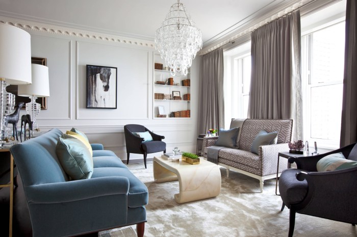
    Window treatments serve as effective tools for managing the intensity and direction of natural light entering your home. Curtains, blinds, and shades offer various levels of light control and privacy. Heavy, lined curtains can effectively block out sunlight and provide excellent insulation, while sheer curtains allow soft, diffused light to filter through. Venetian blinds allow for precise control over light and privacy, with the ability to adjust the slats to control the amount of light entering.

    Roller shades offer a simple and clean aesthetic, providing varying levels of light control depending on the opacity of the material. For instance, in a bedroom, blackout curtains might be used to ensure darkness for sleep, while in a living room, sheer curtains might provide privacy while allowing soft light to enter.

    Comparison of Window Treatments

    Window Treatment Light Control Privacy Insulation
    Curtains (Heavy, lined) High (can block almost all light) High High
    Curtains (Sheer) Low (diffused light) Moderate Low
    Venetian Blinds Moderate (adjustable) Moderate (adjustable) Moderate
    Roller Shades Variable (depending on opacity) Variable (depending on opacity) Moderate

    Interior Design Strategies for Maximizing Natural Light

    Harnessing the power of natural light is not just about strategically placed windows; it’s about orchestrating a symphony of reflective surfaces and thoughtfully arranged furnishings to amplify and distribute that light throughout your home. The following strategies leverage the principles of light reflection and diffusion to create brighter, more inviting spaces.

    Light-Colored Surfaces Enhance Brightness

    The color of your walls, floors, and furniture significantly impacts how light interacts with your space. Light colors, such as whites, creams, pastels, and light grays, reflect a higher percentage of light than their darker counterparts. Darker colors absorb more light, reducing the overall brightness. This phenomenon is governed by the physics of light absorption and reflection; lighter pigments have a higher albedo, meaning they reflect a greater proportion of incident light.

    Consider a room painted in a deep navy blue versus one painted in a soft ivory. The ivory room will appear significantly brighter, even with the same amount of natural light entering. This effect is amplified when considering light-colored flooring materials like light wood or light-colored tiles. Similarly, choosing light-colored furniture allows light to bounce around the room instead of being absorbed.

    Mirrors as Light Redirectors

    Mirrors are exceptionally effective tools for manipulating natural light. Strategically placed mirrors can redirect sunlight from windows deeper into a room, illuminating otherwise shadowed areas. The principle behind this is simple: a mirror reflects light at an equal angle to its incidence. A large mirror placed opposite a window, for instance, will essentially double the amount of light in that area.

    Smaller mirrors can be used to strategically bounce light into corners or hallways. The size and placement of the mirror are crucial; a small mirror will have a limited effect, while a poorly placed large mirror might create unwanted glare. For example, a large mirror placed on a wall adjacent to a north-facing window in a living room can significantly brighten a dark corner, making the space feel more open and inviting.

    Strategic Furniture Placement for Optimal Light Flow

    Furniture placement is crucial for maximizing natural light. Avoid blocking windows with large pieces of furniture. Instead, arrange furniture to complement the light sources. For example, place a sofa perpendicular to a window, allowing light to flow around it rather than directly behind it. Consider using see-through or light-colored furniture to minimize light obstruction.

    A dark, bulky sofa positioned directly in front of a window will cast a significant shadow, drastically reducing the room’s brightness. In contrast, a smaller, lighter-colored sofa positioned to the side will allow more light to penetrate the space. Transparent furniture, such as glass-topped coffee tables, further enhances light transmission.

    Architectural Considerations for Natural Light

    Harnessing natural light effectively requires careful consideration of the building’s architecture. Beyond window placement, strategic architectural design choices can significantly amplify the amount of natural light penetrating a home, reducing energy consumption and enhancing the living experience. This involves understanding the interplay between building orientation, surrounding environment, and the incorporation of specialized architectural features.

    Skylights and Roof Windows: Maximizing Vertical Illumination

    Skylights and roof windows offer a powerful way to introduce natural light from above, supplementing light from side windows and creating a brighter, more evenly lit interior. Their effectiveness stems from their ability to capture diffuse daylight, even on overcast days. Unlike side windows, which are often limited by external obstructions, skylights can access the vast expanse of the sky.

    The angle and size of the skylight influence the amount and direction of light entering the space. Larger skylights generally provide more illumination, while strategically angled skylights can direct light to specific areas, minimizing glare and maximizing diffusion. Consideration should also be given to the type of glazing used, as certain materials offer better light transmission and thermal insulation than others.

    For example, a well-designed skylight in a bathroom can eliminate the need for artificial lighting during daylight hours.

    Architectural Features that Enhance Natural Light

    Several architectural features can significantly enhance the penetration and distribution of natural light within a building. These features work by reflecting, refracting, or directing sunlight deeper into the interior.

    • Light Wells: Light wells are vertical shafts that bring natural light down into lower levels or interior spaces that lack direct access to exterior light sources. They are essentially miniature atriums, functioning as light pipes to brighten otherwise dark areas. A well-designed light well can dramatically improve the ambiance of a basement or inner hallway. Consider using reflective materials within the well to further maximize light distribution.
    • Atriums: Atriums are large, open-air spaces that often extend through multiple levels of a building, creating a central source of natural light and ventilation. Their large glass roofs and walls maximize daylight penetration, creating a bright and airy atmosphere. The size and shape of the atrium, along with the materials used in its construction, will affect its light-gathering capabilities.The iconic Crystal Palace in London, though no longer extant in its original form, is a prime historical example of an atrium designed to maximize natural light.
    • Light Shelves: These horizontal shelves, typically positioned above windows, reflect natural light deeper into the room. They are particularly effective in reducing glare and distributing light more evenly. The design and material of the light shelf directly influence its reflective properties. A light shelf made of highly reflective white material will cast more light than one made of a darker or less reflective material.

    Building Orientation and Surrounding Landscape: Shaping Natural Light

    The orientation of a building in relation to the sun plays a crucial role in determining its natural light potential. South-facing windows in the Northern Hemisphere (and North-facing in the Southern Hemisphere) receive the most direct sunlight throughout the day, providing ample natural illumination. However, excessive sunlight can lead to overheating and glare. Careful consideration of building orientation, window placement, and the use of shading devices (such as overhangs or awnings) are necessary to balance the benefits of solar gain with the need to control heat and glare.

    The surrounding landscape also significantly impacts natural light. Tall trees or buildings can cast shadows, reducing the amount of sunlight reaching the building. Conversely, strategically placed reflective surfaces, such as water features or light-colored paving, can help to increase the amount of light reflected into the building. Consider the seasonal changes in sunlight and shadow patterns when designing a building for optimal natural light.

    Examples of Architecturally Designed Natural Light

    Many contemporary and historical buildings showcase the successful integration of architectural elements to prioritize natural light. The Fallingwater house by Frank Lloyd Wright, for example, masterfully uses its location amongst natural elements to maximize natural light, while strategically positioned windows and overhangs control sunlight and prevent overheating. Similarly, the designs of many Scandinavian homes emphasize large windows and light-colored interiors to take full advantage of limited daylight hours during winter months.

    These designs illustrate how architectural considerations can transform a building from a mere structure into a dynamic interplay between architecture and the natural environment.

    Materials and Finishes that Enhance Natural Light

    Ventilation sunlight concept house efficient consideration intake conceptual

    The careful selection of materials and finishes is crucial in maximizing the benefits of natural light within a home. These choices directly impact how light reflects, diffuses, and is absorbed, ultimately shaping the ambiance and perceived brightness of each space. Understanding the properties of various materials allows for the strategic creation of luminous and inviting interiors.

    Surface reflectivity plays a pivotal role in light distribution. Glossy surfaces, for example, exhibit high reflectivity, bouncing light around the room and creating a brighter, more energetic atmosphere. Conversely, matte finishes absorb more light, leading to a calmer, more subdued environment. The color of the material also significantly influences light interaction. Lighter colors reflect more light than darker colors, which tend to absorb it.

    Floor Material Impact on Light Reflection

    Flooring significantly influences the overall brightness of a room. Light-colored hardwood floors, for instance, with their inherent reflective properties, contribute significantly to a room’s luminosity. The polished surface of these floors acts like a mirror, bouncing light upwards, brightening walls and ceilings. In contrast, dark-colored hardwood floors or carpeting absorb a substantial amount of light, reducing the overall brightness.

    A light-colored tile floor, particularly one with a glossy finish, would also excel at reflecting light. Consider the difference between a room with dark brown hardwood and one with pale oak; the latter will feel considerably brighter, even with the same amount of natural light entering.

    Paint Color and Light Perception

    The impact of paint color on light perception is substantial. Lighter colors, such as whites, creams, and pastels, reflect a higher percentage of light, making a room appear larger and brighter. This effect is based on the principle of light reflection; lighter pigments scatter light more effectively. Conversely, darker colors absorb more light, creating a cozier, more intimate feeling but potentially diminishing the impact of natural light.

    A room painted in a deep navy blue, for example, will appear smaller and darker than the same room painted in a soft white, even with identical window sizes and sunlight exposure. The scientific basis for this lies in the absorption and reflection of light wavelengths by different pigments.

    Materials to Avoid When Designing for Natural Light

    It’s equally important to understand which materials to avoid when aiming for a bright and airy space. Choosing materials that absorb or block light can significantly reduce the effectiveness of natural light sources.

    The following materials should be used cautiously or avoided altogether in areas where maximizing natural light is a priority:

    • Dark-colored fabrics for curtains or upholstery: These absorb significant amounts of light.
    • Dark-colored carpets and rugs: Similar to dark-colored floors, these materials absorb rather than reflect light.
    • Thick, heavy curtains: While providing privacy, these can block substantial amounts of natural light, especially if they are dark in color or made of dense material.
    • Dark-colored cabinetry and furniture: These significantly reduce light reflection in the surrounding area.
    • Large, solid objects that cast significant shadows: Strategically positioning furniture and décor is essential to prevent unnecessary shadowing.

    Illustrative Examples of Homes with Abundant Natural Light

    Natural room lighting security light cctv artificial cameras installations tips pakenham balaclava melbourne change trends serious au metford

    The effective utilization of natural light significantly impacts a home’s ambiance, energy efficiency, and overall occupant well-being. Different design approaches cater to various needs and contexts, highlighting the versatility of natural light integration in architecture. The following examples demonstrate diverse strategies for maximizing natural light in residential settings.

    Maximizing Natural Light in a Small Space

    A compact, urban dwelling, approximately 500 square feet, can be dramatically brightened through careful planning. The primary living area, encompassing the kitchen, dining, and living room, is designed as an open-plan space to allow light to flow freely. A large, south-facing window dominates one wall, maximizing direct sunlight during the day. This window extends from near the ceiling to close to the floor, minimizing obstructions and maximizing light penetration.

    To further amplify the light, reflective surfaces, such as white walls and light-colored wood flooring, are employed. These surfaces bounce light throughout the space, creating a bright and airy atmosphere. Strategically placed mirrors on the opposite wall facing the window add to this effect. Sheer, white curtains allow for light diffusion and privacy control. The bathroom, located adjacent to the main living area, incorporates a skylight to draw in natural light from above, reducing the need for artificial lighting.

    Blending Natural and Artificial Lighting for a Warm Atmosphere

    A larger family home, around 2000 square feet, showcases a harmonious blend of natural and artificial lighting. Large windows in the living room and master bedroom allow ample natural light during the day. However, the design incorporates a layered lighting scheme to create a warm and inviting atmosphere, particularly during evenings and on overcast days. Recessed lighting is used throughout the home for general illumination, providing a soft, even light.

    In the living room, a statement pendant light above the dining table adds a focal point and ambient lighting. Task lighting, such as desk lamps and reading lights, is strategically placed to support specific activities. Warm-toned light bulbs (around 2700K) are used throughout the house to enhance the cozy feel, mimicking the warmth of natural sunlight. Dimmers are installed on most light fixtures, allowing for adjustable brightness levels to suit different moods and times of day.

    This ensures that the artificial lighting complements and enhances the natural light, rather than competing with it.

    Sustainable Design for Energy Efficiency and Natural Light

    An environmentally conscious home design prioritizes passive solar design principles and energy-efficient materials. Triple-pane windows with low-E coatings are used throughout the home to maximize insulation and minimize heat loss. These windows effectively reduce energy consumption associated with heating and cooling while allowing ample natural light to penetrate the interior. The home’s orientation is strategically planned to maximize solar gain in winter and minimize it in summer.

    Overhangs and strategically placed trees provide shading during the hotter months, preventing overheating. High-performance insulation in walls, roofs, and floors reduces heat transfer, minimizing energy needed for climate control. The use of light-colored, highly reflective materials for both exterior and interior surfaces further contributes to the passive solar design strategy. This approach reduces the reliance on artificial lighting and minimizes the energy consumption of the home, contributing to a sustainable and energy-efficient living environment.

    Designing a home that embraces natural light is a journey of understanding both the physics of light and the psychology of space. By thoughtfully considering window placement, material choices, and interior design strategies, we can create environments that are not only energy-efficient but also promote a sense of well-being and connection with the natural world. The principles Artikeld here – from the precise angles of sunlight to the subtle interplay of colors and textures – empower you to craft a home that is both beautifully lit and sustainably designed, a testament to the harmonious blend of science and artistry in architectural design.

    Clarifying Questions

    What are the best window coverings for maximizing natural light while maintaining privacy?

    Sheer curtains or blinds allow ample light diffusion while offering privacy. Cellular shades provide insulation and light control.

    How can I maximize natural light in a north-facing room?

    Utilize light-colored walls and furniture to reflect available light. Consider strategic mirror placement to bounce light deeper into the room. Maximize window size and consider a light-colored flooring material.

    Are there any downsides to excessive natural light?

    Yes, excessive direct sunlight can cause fading of fabrics and furniture. Overexposure to UV rays can also be harmful. Proper window treatments are essential to manage and control light levels.

    How do I incorporate natural light into a basement or lower level?

    Use strategically placed skylights or strategically positioned windows that are high enough to avoid blocking light from other areas. Employ light-colored paint and reflective surfaces to maximize light penetration.

    What are some energy-efficient options for maximizing natural light?

    Energy-efficient windows with low-E coatings minimize heat loss and gain while allowing maximum light transmission. Proper insulation further reduces energy consumption.

    Read More: Kanavino.org

  • How to Design a Home with Neutral Tones

    How to Design a Home with Neutral Tones

    How to Design a Home The allure of a home bathed in neutral tones lies in its inherent versatility. Neutral palettes, far from being bland, offer a canvas upon which personal style can be richly painted. From the calming serenity of a minimalist haven to the warm embrace of a rustic retreat, neutral colors provide a foundation for diverse aesthetics, influenced by the interplay of light, texture, and carefully chosen accents.

    This exploration delves into the art of harnessing the power of neutral tones to craft a home that reflects individual taste while maintaining a sense of timeless elegance.

    Understanding the psychology of color is key. Cool neutrals like greys and blues evoke feelings of calm and spaciousness, while warmer shades such as beige and cream create a sense of coziness and comfort. The strategic selection of materials—the smooth coolness of stone, the warm grain of wood, the soft texture of linen—further enhances the overall mood and ambiance.

    This guide provides a step-by-step approach to designing a home with neutral tones, considering room-specific needs and the artful incorporation of pops of color and pattern to avoid monotony.

    Defining Neutral Tones

    Living room neutral interior choose board decor

    Neutral tones form the bedrock of sophisticated and versatile interior design. Their inherent adaptability allows for a wide range of stylistic expressions, from minimalist chic to warm and inviting spaces. Understanding the nuances of these tones and their psychological effects is crucial for creating a home environment that reflects personal preferences and promotes well-being.Neutral colors are characterized by their lack of strong chromatic properties.

    They typically fall within the beige, gray, and brown families, often incorporating subtle hints of other colors. Their versatility stems from their ability to act as a backdrop, allowing bolder accent colors to shine, or as the dominant hue, creating a calming and harmonious atmosphere. The scientific basis for their impact lies in their effect on light reflection and the subsequent perception of space and mood.

    Neutral Color Palettes for Home Design

    The selection of a neutral palette significantly influences the overall ambiance of a living space. Different shades evoke different feelings and can alter the perceived size and brightness of a room. Consider these examples:

    • Warm Neutrals: These palettes incorporate beige, taupe, cream, and warm grays. They create a cozy and inviting atmosphere, often associated with feelings of comfort and security. Imagine a living room painted in a creamy beige, accented with warm taupe textiles and furniture. The warmth of these tones creates a welcoming and relaxed environment.
    • Cool Neutrals: This palette utilizes cooler grays, silvers, and muted blues. These colors create a sense of calm and serenity, often making a space feel more spacious and airy. Picture a bedroom painted in a soft, cool gray, with white bedding and silver accents. The cool tones promote relaxation and tranquility.
    • Monochromatic Neutrals: This approach uses various shades of a single neutral color, such as different shades of gray or beige. This creates a sophisticated and unified look, emphasizing texture and form. Visualize a bathroom with varying shades of gray—from a light gray on the walls to a darker gray on the floor tiles. The subtle variations in shade add depth without disrupting the overall sense of unity.

    Psychological Impact of Neutral Shades

    The psychological impact of color is a well-documented phenomenon. Neutral tones, while seemingly understated, significantly affect our emotional state and perception of space.

    • Beige and Cream: Often associated with feelings of comfort, security, and nostalgia. They promote relaxation and a sense of familiarity.
    • Gray: Gray can represent sophistication and calm, but darker shades can sometimes feel cold or sterile if not balanced with warmer elements. Lighter grays can create a sense of spaciousness and airiness.
    • Brown: Evokes feelings of earthiness, stability, and groundedness. It can create a warm and inviting atmosphere, especially when used in conjunction with natural materials.

    Example Neutral Color Palette for a Home

    This palette uses varying shades of beige, gray, and white to create a balanced and harmonious atmosphere throughout the house.

    Room Wall Color Accent Color Furniture/Textiles
    Living Room Warm Beige (SW 7004) Taupe Natural wood furniture, cream-colored sofa, taupe throw pillows
    Bedroom Light Gray (SW 7029) Silver White bedding, silver accents, gray rug
    Kitchen Off-white (SW 7005) Warm Gray Light wood cabinets, gray countertops, white backsplash
    Bathroom Soft Gray (SW 7067) White White fixtures, gray tiles, white towels

    Selecting Materials and Textures

    The successful integration of neutral tones in home design hinges not just on color selection, but also on a thoughtful approach to materials and textures. The interplay of these elements creates depth, visual interest, and a sense of warmth or coolness, depending on the desired atmosphere. Understanding the properties of different materials and how textures interact is crucial for achieving a balanced and sophisticated neutral-toned space.The strategic use of various materials and textures allows for the creation of visual interest and depth within the confines of a neutral color palette.

    This prevents a space from feeling monotonous or flat, while maintaining the calming and versatile qualities associated with neutral tones. Different materials also possess unique textural properties that influence the overall feel of a room, impacting light reflection and the perception of space.

    Material Selection for Neutral Palettes

    Natural materials often complement neutral color schemes exceptionally well. Their inherent variations in color and texture add subtle visual interest without overwhelming the palette. For example, light oak hardwood flooring, with its warm, slightly honeyed tones, pairs beautifully with off-white walls and beige upholstery. The natural grain of the wood introduces texture and visual complexity, preventing the space from appearing sterile.

    Similarly, the cool gray tones of honed limestone tiles can create a sophisticated and calming atmosphere in a bathroom, especially when paired with muted gray-green walls. In contrast, the rough texture of linen curtains or a wool throw adds a tactile element and a sense of cozy warmth. The variations in color and texture within these natural materials are far more nuanced than a simple paint color, allowing for a more dynamic and visually rich interior.

    Texture Contrast and Visual Interest

    The juxtaposition of contrasting textures is a key design strategy for adding visual depth and interest to a neutral-toned home. Consider the interplay of smooth and rough textures: the smooth surface of a lacquered coffee table might be contrasted with the rough texture of a hand-woven rug. This combination provides a pleasing visual balance, preventing the space from feeling overly uniform.

    The smooth surface reflects light differently than the rough surface, adding another layer of visual complexity. Furthermore, the contrast between a smooth marble countertop and the coarse weave of a linen tablecloth introduces a dynamic tension that is both visually appealing and subtly luxurious.

    Incorporating Diverse Textures Within a Neutral Theme

    To effectively incorporate diverse textures without compromising the neutral theme, it is essential to maintain a cohesive color palette. While the textures may differ significantly—from the smooth coolness of glass to the warmth of woven fabrics—the underlying colors should remain within the neutral spectrum. For example, a living room might feature a plush velvet sofa in a light gray, a chunky knit throw in a creamy off-white, and a sleek glass coffee table.

    All these elements maintain the neutral color scheme while introducing a rich variety of textures. This approach prevents the textures from clashing or distracting from the overall sense of calm and sophistication that neutral tones provide. The key is to carefully select textures that complement each other, rather than competing for attention. A thoughtful consideration of texture also adds a tactile dimension to the space, enriching the overall sensory experience.

    Room-by-Room Design with Neutral Tones

    Neutral tones, encompassing a spectrum from warm beiges to cool grays, provide a versatile backdrop for any home design. Their inherent adaptability allows for the incorporation of diverse textures, patterns, and pops of color, creating spaces that are both visually appealing and psychologically calming. The following sections detail how to effectively utilize neutral palettes in different rooms, maximizing their potential for creating serene and stylish environments.

    Living Room Design with Neutral Tones

    The living room, often the heart of the home, benefits greatly from a carefully chosen neutral palette. A foundation of warm, creamy whites or light greige on the walls creates a sense of spaciousness and allows other design elements to shine. This approach, supported by research showing that lighter colors can make rooms feel larger (Journal of Environmental Psychology, 2010), enhances the room’s functionality and ambiance.

    Furniture Item Color Material Placement
    Sofa Light Gray Linen Center of the room, facing the fireplace
    Armchairs (2) Off-white Velvet Flanking the fireplace
    Coffee Table Natural Wood Oak In front of the sofa
    Rug Cream with subtle beige pattern Wool Underneath the sofa and armchairs

    Bedroom Design with Neutral Tones

    Creating a restful and inviting bedroom relies heavily on the careful selection of colors and textures. A neutral color scheme, using shades of taupe, beige, or soft gray, promotes relaxation and sleep quality. Studies have indicated a correlation between calming environments and improved sleep (Sleep Medicine Reviews, 2017). The following design elements contribute to a cohesive and tranquil atmosphere:

    • Wall Color: Soft gray or warm beige, providing a soothing backdrop.
    • Bed Linens: High-thread-count cotton sheets in creamy white or light gray, complemented by a textured throw blanket in a neutral tone with subtle pattern.
    • Lighting: Layered lighting incorporating a dimmer switch for adjustable brightness; a bedside lamp with a warm-toned bulb for reading, and ambient overhead lighting for general illumination.
    • Curtains: Linen curtains in a light beige or off-white, allowing natural light to filter in while providing privacy.
    • Accessories: Natural wood nightstands, a woven rug, and simple, uncluttered decor in muted tones.

    Kitchen Design with Neutral Tones

    The kitchen, a space for both functionality and aesthetic appeal, can benefit from a neutral color scheme that enhances its practicality and visual harmony. A neutral palette offers a clean, timeless look, making it easier to update accessories and decor over time. The choice of materials plays a significant role in achieving the desired aesthetic.

    • Cabinetry: Shaker-style cabinets in a light gray or off-white, offering a classic and versatile look.
    • Countertops: Quartz countertops in a light beige or white, providing durability and a clean aesthetic. Alternatively, a honed marble countertop offers a more luxurious feel.
    • Backsplash: Subway tiles in a white or light gray, offering a clean and timeless look. Alternatively, a patterned tile in muted tones can add visual interest.
    • Flooring: Light-colored wood flooring or large-format porcelain tiles, enhancing the sense of spaciousness and cleanliness.
    • Hardware: Brushed nickel or matte black hardware, providing a sophisticated contrast against the lighter cabinetry.

    Incorporating Pops of Color and Patterns

    The strategic introduction of color and pattern within a neutral-toned home is crucial for creating visual interest and personality without disrupting the calming effect of the base palette. The human visual system is highly sensitive to color contrast and pattern recognition, making these elements powerful tools in interior design. Understanding the principles of color psychology and visual weight allows for a harmonious blend of calmness and vibrancy.The effective use of accent colors and patterns hinges on understanding their psychological impact and visual weight.

    Accent colors, strategically placed, can energize a space, highlight architectural features, or create focal points. Patterns, similarly, can add texture and depth, but their scale and complexity must be carefully considered to avoid overwhelming the neutral backdrop. For instance, a bold geometric pattern might be suitable for a small accent wall, while a delicate floral print might be better suited for upholstery or soft furnishings.

    The principles of Gestalt psychology, specifically the laws of proximity and similarity, can guide the arrangement of these elements to create a cohesive and visually appealing space.

    Strategic Placement of Accent Colors

    Accent colors should be introduced deliberately, avoiding a chaotic scattering. Consider the color wheel and its complementary, analogous, and triadic relationships to select colors that harmonize with the neutral base. For example, a cool grey palette might be complemented by pops of teal or deep blue, while a warm beige scheme could be enhanced with burnt orange or terracotta.

    The size and placement of these accent colors influence their visual impact. A small, intensely colored object can create a strong focal point, while a larger area of a less saturated color will have a more subtle effect. Think of the impact of a single vibrant cushion on a neutral sofa versus a wall painted in a muted pastel shade.

    The former creates a sharper, more defined focal point, while the latter creates a more diffused, softer effect.

    Subtle Use of Patterns

    Patterns, like colors, possess visual weight. Large, bold patterns can dominate a space, while smaller, more delicate patterns recede into the background. Consider the scale of the room and the furniture when selecting patterns. A small room might be overwhelmed by a large-scale pattern, while a large room could benefit from a more substantial pattern to add visual interest.

    The type of pattern also matters. Geometric patterns can create a modern, structured feel, while floral patterns can add a touch of romance or whimsy. The interplay of pattern and texture adds another layer of complexity; a textured fabric with a subtle pattern can create a richer visual experience than a plain, smooth surface. Think of the difference between a smooth, painted wall and a wall covered in textured wallpaper with a delicate geometric pattern.

    The latter offers greater visual depth and tactile interest.

    Bathroom Design with Neutral Tones and a Single Accent Color

    This example demonstrates a bathroom designed primarily in neutral tones with a single accent color: a calming, spa-like atmosphere is achieved using a palette of warm greys and off-whites, accented with a deep teal. The teal is used sparingly, yet effectively, to create a focal point.

    Surface Color Description
    Walls Warm Grey (Light) Provides a neutral backdrop, enhancing the feeling of spaciousness.
    Floor Off-White Tiles Creates a clean, bright foundation, reflecting light and adding to the airy feel.
    Vanity Off-White Maintains consistency with the overall neutral scheme.
    Towels, Bathmat Deep Teal Provides a striking contrast against the neutral tones, adding a pop of color and visual interest.

    Lighting and Ambiance in Neutral Spaces

    Neutral tones, while inherently versatile, rely heavily on lighting to reveal their full potential and create the desired atmosphere. The interplay of natural and artificial light sources significantly impacts the perception of these subtle hues, transforming a space from stark and cold to warm and inviting. Understanding this dynamic is crucial for achieving a truly successful neutral-toned interior.The interaction between light and neutral colours is governed by the principles of color perception and light absorption.

    Neutral colours, primarily encompassing shades of white, beige, gray, and taupe, reflect light differently depending on their undertones and the type of light source illuminating them. Warm-toned neutrals, with hints of yellow or orange, appear richer and more inviting under warm-toned lighting, while cool-toned neutrals, with hints of blue or green, benefit from cooler lighting sources. Conversely, using contrasting light sources can create unexpected and sometimes undesirable effects.

    For instance, cool-toned lighting on warm-toned neutrals might make the space appear drab, while warm lighting on cool-toned neutrals could make them appear yellowish.

    Natural Light’s Influence on Neutral Tones

    Natural light, with its inherent variability throughout the day, presents both opportunities and challenges. Direct sunlight can dramatically alter the perception of neutral tones, sometimes washing them out or making them appear brighter than intended. Conversely, soft, diffused natural light can subtly enhance the texture and depth of these colours, revealing subtle variations that might otherwise be missed.

    Strategic window placement and the use of sheer curtains or blinds can help control the intensity and direction of natural light, ensuring a consistently pleasant ambiance. For example, placing sheer curtains on east-facing windows can diffuse the strong morning sun, preventing the space from becoming overly bright and potentially washing out the neutral palette.

    Creating Warmth with Artificial Lighting

    Artificial lighting plays a crucial role in setting the mood and enhancing the warmth of a neutral-toned home. Layering different types of lighting – ambient, task, and accent – is essential for achieving a balanced and inviting atmosphere. Warm-toned light sources, such as incandescent bulbs or LED bulbs with a warm white color temperature (around 2700K), create a cozy and inviting feel, particularly effective in living rooms and bedrooms.

    In contrast, cooler-toned light sources (around 4000K-5000K) are better suited for task lighting in kitchens and bathrooms, where clear visibility is paramount. Dimmers are another powerful tool, allowing for precise control over the intensity of light and the resulting atmosphere. A dimmed warm-toned light source can transform a space from functional to intimate in an instant.

    Lighting Fixture Examples for Neutral-Toned Homes

    The selection of lighting fixtures is as crucial as the choice of light sources themselves. In a living room, a large, statement pendant light made of natural materials like woven rattan or wood can add warmth and texture, complementing the neutral palette. For bedrooms, a bedside lamp with a linen shade and a brass base provides both ambient and task lighting, creating a serene and restful atmosphere.

    In a kitchen, recessed lighting provides functional illumination, while under-cabinet lighting highlights countertops and adds a touch of sophistication. In a bathroom, a vanity light with frosted glass diffuses light evenly, creating a soft and inviting glow. These examples showcase how the material and style of the lighting fixture can enhance the overall aesthetic and functionality of a neutrally decorated home, while also influencing the perception and reflection of light, therefore affecting the perception of the neutral colour palette.

    Illustrative Examples of Neutral-Toned Homes

    Neutral living rooms room accent chairs leather dreamy

    The effective use of neutral tones in home design transcends mere aesthetics; it’s a scientifically-backed approach to creating calming, versatile, and adaptable living spaces. The following examples demonstrate how diverse architectural styles and design preferences can be seamlessly integrated with a neutral palette, showcasing the flexibility and enduring appeal of this approach.

    Modern Minimalist Home in Neutral Tones

    This design prioritizes clean lines, functionality, and a sense of spaciousness. Imagine a home with high ceilings and expansive windows, flooding the interior with natural light. The walls are painted in a warm, off-white shade, such as “Swiss Coffee” or a similar warm white. The flooring consists of wide, light grey oak planks, contributing to the airy feel. Furniture is minimalist and multifunctional.

    A low-slung, modular sofa in a light grey fabric anchors the living area, complemented by a simple coffee table made of light oak or bleached wood. Built-in shelving units, painted the same off-white as the walls, provide storage without visually cluttering the space. Subtle pops of texture are introduced through a natural fiber rug and a few carefully chosen accessories in muted tones of beige and grey.

    The overall effect is one of serene simplicity and understated elegance. The absence of visual clutter minimizes stress and promotes relaxation, a well-documented effect of minimalist design supported by research in environmental psychology.

    Traditional Home Decorated with a Neutral Palette

    This style embraces the warmth and richness of traditional design while maintaining a cohesive neutral color scheme. Imagine a home with high ceilings, crown molding, and hardwood floors in a medium-toned oak. Walls are painted in a creamy, warm white, allowing the architectural details and antique furniture to take center stage. Furniture pieces are carefully curated, featuring antique or antique-style pieces in dark wood finishes, such as cherry or mahogany.

    These pieces are often upholstered in neutral fabrics such as linen or velvet in shades of beige, ivory, or taupe. Accessories include antique mirrors, framed artwork with muted colors, and decorative objects made of natural materials like ceramic or stone. The overall atmosphere is one of sophisticated comfort and timeless elegance. The use of antique furniture adds character and history, creating a unique and personal space.

    The neutral palette allows the patina and craftsmanship of the antique pieces to shine, avoiding visual competition between colors.

    Rustic-Style Home Using Neutral Colors and Natural Materials

    This style emphasizes natural materials and textures, creating a warm and inviting atmosphere. Imagine a home with exposed wooden beams, stone fireplaces, and walls clad in natural wood or whitewashed brick. The flooring is made of wide, reclaimed wood planks, showcasing the natural variations in color and grain. Furniture is crafted from natural materials such as wood, rattan, or wrought iron.

    The color palette features a range of neutral tones, from creamy whites and warm beiges to earthy browns and greys. Textiles play a significant role, with woven rugs, linen curtains, and throws adding layers of texture and warmth. The overall atmosphere is one of rustic charm and relaxed comfort. The use of natural materials promotes a connection with nature, which studies have shown to have a positive impact on mental well-being.

    The neutral color palette enhances the natural beauty of the materials without overpowering the space.

    Designing with neutral tones is not about limiting creativity; it’s about establishing a foundation of tranquility and sophistication. By carefully considering color palettes, material choices, and lighting strategies, you can craft a home that is both aesthetically pleasing and emotionally resonant. The journey from blank canvas to a beautifully curated space involves understanding the subtle nuances of color psychology and the powerful impact of texture.

    The result? A home that is not only visually stunning but also a sanctuary of peace and personal expression, a testament to the transformative power of design.

    FAQ Insights

    What are some unexpected ways to add visual interest to a neutral-toned room?

    Incorporate interesting architectural details like built-in shelving or a statement fireplace. Use varied heights and scales in furniture placement to create visual rhythm. Introduce unique lighting fixtures with interesting shapes or materials.

    How can I avoid a neutral-toned room from feeling cold?

    Layer textures like plush rugs, soft throws, and velvet cushions. Incorporate warm metallic accents like brass or copper. Use warm-toned lighting, such as incandescent bulbs or warm-white LEDs.

    What if I’m afraid of making my home look too stark or boring with neutral tones?

    Start with a base of lighter neutrals and gradually introduce darker shades through accessories and furniture. Remember that the strategic use of texture and pattern can significantly enhance visual interest. Don’t hesitate to experiment with different shades and materials to find the perfect balance for your space.

    Are there any specific neutral color palettes that are currently trending?

    Warm greige tones are currently popular, offering a sophisticated blend of gray and beige. Muted greens and blues are also trending, bringing a touch of nature indoors. However, the best palette depends on your personal preferences and the existing architectural features of your home.

    How do I choose the right lighting for a neutral-toned space?

    Layer your lighting! Combine ambient lighting (overhead fixtures), task lighting (desk lamps), and accent lighting (floor lamps or wall sconces) to create depth and warmth. Experiment with different bulb colors (warm white is generally recommended) to achieve the desired ambiance.

    Read More: Kanavino.org

  • How to Blend Different Home Styles

    How to Blend Different Home Styles

    How to Blend Different The art of blending disparate home styles—from the rustic charm of Farmhouse to the sleek minimalism of Modern—is a fascinating exploration of design principles. It’s not merely about combining elements; it’s about creating a harmonious whole where contrasting aesthetics complement each other, resulting in a space that reflects individual personality while adhering to the fundamental rules of visual balance and flow.

    This journey into interior design will unravel the secrets of successful style fusion, drawing upon the scientific principles of visual perception and the established rules of interior design theory.

    Understanding the underlying characteristics of different styles—their architectural features, color palettes, and materials—is crucial. We will delve into the specifics of five distinct styles, analyzing their unique attributes to identify potential points of synergy. This foundational knowledge will empower you to make informed decisions, fostering a space that is both aesthetically pleasing and functionally efficient. We will then move onto practical techniques and demonstrate how to seamlessly integrate elements from various styles, avoiding common pitfalls like visual clutter and stylistic dissonance.

    Defining Home Styles

    Understanding the nuances of different home styles is crucial for successful blending. Architectural styles are not merely aesthetic choices; they reflect historical trends, technological advancements, and cultural influences, each leaving a distinct imprint on the built environment. Analyzing these styles helps us appreciate the underlying principles that govern their design and allows for informed decisions when merging elements.

    Five Distinct Home Styles

    Five prominent home styles—Farmhouse, Modern, Victorian, Mid-Century Modern, and Traditional—exhibit diverse characteristics that reflect their origins and design philosophies. These differences are primarily expressed through their architectural features, color palettes, and the materials used in their construction. A comparative analysis reveals both their unique identities and potential points of convergence for harmonious blending.

    Architectural Features, Color Palettes, and Common Materials

    The Farmhouse style, originating from rural American life, emphasizes functionality and simplicity. Its architectural features often include a gable roof, wide porches, and large windows, reflecting a need for natural light and ventilation. The color palette typically leans towards muted tones of white, beige, and gray, with pops of color from natural elements like wood and greenery. Common materials include wood, stone, and metal, often left exposed to showcase their natural textures.In contrast, Modern architecture, emerging in the early 20th century, prioritizes clean lines, open spaces, and a minimalist aesthetic.

    Home Style Architectural Style Color Palette Materials
    Farmhouse Gable roof, wide porches, large windows Muted whites, beiges, grays; natural accents Wood, stone, metal
    Modern Flat roof, large glass expanses, geometric forms Neutral, monochromatic (whites, grays, blacks) Concrete, steel, glass
    Victorian Steeply pitched roof, towers, decorative gables Rich jewel tones, vibrant colors, contrasting accents Wood, brick, stone (often intricately carved)
    Mid-Century Modern Low-pitched roof, open floor plan, natural materials Muted greens, yellows, browns; pops of brighter colors Wood, concrete, glass
    Traditional Symmetrical facade, formal proportions, columned porches Neutral creams, whites, grays; darker accents Brick, stone, wood

    Identifying Compatible Styles

    Blending home styles successfully is a delicate dance between shared elements and harmonious contrasts. It’s about understanding the underlying principles of design that unify seemingly disparate aesthetics, creating a cohesive and visually appealing space. This involves identifying common threads—be it color palettes, material choices, or architectural details—and strategically utilizing them to bridge the gap between different styles. The key lies not in forcing a match, but in finding a balance that allows each style to contribute its unique character to the overall design.The successful integration of different home styles relies on recognizing underlying principles of design.

    These principles, often rooted in psychology and visual perception, govern how we perceive and interpret spatial arrangements and aesthetic choices. For example, the principle of visual weight, which describes how different elements command attention, plays a crucial role. A bold, rustic fireplace might balance a more delicate, minimalist seating arrangement, preventing visual imbalance. Similarly, the principle of proportion dictates that the scale of different design elements should be harmonious.

    A grand Victorian staircase, for example, might be successfully complemented by contemporary, streamlined furnishings, provided the scale of the furniture is appropriately considered in relation to the staircase’s grandeur.

    Shared Elements as Unifying Factors

    Identifying common ground between seemingly disparate styles often involves focusing on shared elements. For instance, a farmhouse style, characterized by its rustic charm and natural materials, can be seamlessly blended with a modern style, known for its clean lines and minimalist aesthetic, by utilizing a shared color palette of neutral tones, such as whites, grays, and beiges. The use of natural materials like wood and stone further bridges the gap, creating a sense of continuity between the two styles.

    Similarly, the incorporation of similar textures, such as rough-hewn wood beams in a farmhouse setting and smooth, polished concrete floors in a modern setting, can create a visual harmony despite the distinct styles. The strategic use of these shared elements acts as a unifying force, preventing the space from feeling disjointed or chaotic.

    Harmonious Contrasts: Creating Visual Interest

    While shared elements provide a foundation for successful style blending, the introduction of harmonious contrasts adds depth and visual interest. The juxtaposition of a sleek, modern kitchen with traditional, ornate cabinetry can be incredibly effective, provided the contrast is carefully managed. For example, the use of a consistent color palette and material choices—such as stainless steel appliances in both areas—can help to unify the space despite the contrasting styles.

    The key is to ensure that the contrasts complement each other, rather than clash. A well-executed contrast can highlight the unique qualities of each style, creating a more dynamic and engaging space. This principle is echoed in the field of color theory, where complementary colors—colors opposite each other on the color wheel—are known to create a vibrant and visually stimulating effect when used together.

    Successful Style Blends: Case Studies

    Consider a home that blends elements of mid-century modern and industrial styles. The clean lines and functional furniture of mid-century modern are complemented by the raw, exposed brick and metal accents of industrial design. The shared use of neutral colors, such as charcoal gray and warm browns, along with materials like wood and metal, creates a cohesive feel. The contrast between the smooth curves of mid-century furniture and the rough textures of exposed brick adds visual interest without disrupting the overall harmony.Another example is the successful fusion of rustic farmhouse and bohemian styles.

    The natural materials and earthy tones common to both styles create a solid foundation. The farmhouse’s simplicity is balanced by the bohemian’s eclectic mix of patterns and textures, resulting in a space that is both inviting and visually stimulating. The use of woven textiles, vintage finds, and natural light further enhances the blend, creating a comfortable and uniquely styled living space.

    In both examples, careful consideration of color palettes, material choices, and the principles of visual weight and proportion are key to the success of the blend.

    Blending Techniques

    Harmoniously merging disparate home styles requires a nuanced understanding of design principles and a strategic approach. The key lies not in simply combining elements, but in thoughtfully integrating them to create a cohesive and visually appealing space. This process involves a careful selection of compatible styles, a strategic implementation of transitional elements, and an appreciation for the psychological impact of design choices on the overall atmosphere.

    Success hinges on understanding the underlying principles of each style and employing techniques that bridge the gap between them, rather than forcing an unnatural juxtaposition.Successfully blending two home styles is akin to conducting a carefully orchestrated symphony. Each style represents a distinct instrument, and the designer acts as the conductor, ensuring each instrument plays its part while contributing to a harmonious whole.

    This requires a detailed plan, a methodical approach, and a keen eye for detail.

    A Step-by-Step Guide to Style Integration

    This guide Artikels a practical approach to seamlessly integrating two distinct home styles. The process involves a phased approach, starting with a clear understanding of the desired outcome and progressing through the selection and placement of key elements.

    1. Style Selection and Analysis: Begin by identifying the two primary styles you wish to blend. Analyze their core characteristics—color palettes, materials, furniture silhouettes, and decorative motifs. For example, consider blending the clean lines and minimalist aesthetic of Mid-Century Modern with the warm, rustic charm of Farmhouse style. Understanding the inherent contrasts and similarities is crucial.
    2. Dominant Style Determination: Choose one style to serve as the dominant theme, forming the foundation of the space. In our Mid-Century Modern and Farmhouse example, let’s say Mid-Century Modern is the dominant style. This ensures a cohesive base upon which the secondary style can be subtly layered.

    Incorporating Elements from One Style into Another

    The successful integration of elements from one style into a space predominantly designed in another hinges on thoughtful selection and placement. Consider the following:Imagine a living room primarily designed in a sleek, contemporary style. To introduce elements of a bohemian style, one might incorporate a large, patterned rug with rich textures, plush cushions in vibrant colors and eclectic patterns, and macrame wall hangings.

    These elements add a touch of bohemian flair without disrupting the overall contemporary feel. The key is to maintain a sense of balance; avoid overwhelming the space with too many elements from the secondary style.

    Common Transitional Elements

    Transitional elements act as bridges between disparate styles, creating a sense of harmony and cohesion.

    • Rugs: Rugs are powerful tools for blending styles. A rug with a geometric pattern (modern) and natural fibers (rustic) can seamlessly unify contrasting aesthetics.
    • Lighting: Lighting fixtures can subtly introduce elements of a secondary style. A modern pendant light with a natural wood finish can bridge the gap between contemporary and rustic styles.
    • Textiles: Throw pillows, blankets, and curtains can incorporate textures and patterns from a secondary style without being overly dominant.
    • Artwork: Artwork can act as a visual connector, incorporating elements of both styles. A modern abstract painting with a rustic wooden frame can be a subtle yet effective bridge.
    • Accessories: Carefully selected accessories, such as vases, candles, and decorative objects, can add touches of a secondary style without disrupting the overall harmony.

    Visual Examples and Illustrations

    Traditional modern furniture mixing mix living room nate rooms berkus beautiful

    The successful blending of disparate home styles hinges on a careful consideration of color palettes, texture interplay, and the strategic placement of furniture. Understanding the underlying principles of each style allows for a harmonious fusion, creating a space that is both aesthetically pleasing and functionally effective. The following examples illustrate how seemingly contrasting styles can be seamlessly integrated to create unique and inviting living spaces.

    A Farmhouse-Modern Living Room

    This living room exemplifies the successful marriage of rustic farmhouse charm and sleek modern minimalism. The foundational element is a neutral color palette—think creamy whites, soft greys, and muted earth tones—which provides a calming backdrop for both styles. The walls are painted a soft, warm white, allowing the textures of the room to take center stage. A large, plush, modern sectional sofa in a light grey linen provides ample seating.

    Its clean lines and simple silhouette contrast beautifully with a reclaimed wood coffee table, its rough-hewn surface showcasing the natural beauty of the wood. A vintage farmhouse-style rug, woven with natural fibers like jute or wool, adds warmth and texture underfoot, grounding the space and adding a touch of rustic charm. Metal accents, such as a sleek black floor lamp and a geometrically-shaped side table, inject a touch of modern industrial style.

    The overall effect is a space that feels both relaxed and sophisticated, showcasing the inherent compatibility of farmhouse and modern aesthetics. The careful balance of rustic and refined elements creates a space that is both inviting and stylish.

    A Traditional-Mid-Century Modern Kitchen

    This kitchen seamlessly blends the warmth of traditional design with the clean lines of mid-century modern style. The cabinetry is a key element in this fusion. Lower cabinets are crafted from rich, dark wood, echoing the classic traditional aesthetic. Their solid construction and detailed molding create a sense of permanence and quality. However, the upper cabinets are sleek and frameless, characterized by the simple, clean lines typical of mid-century modern design.

    These are painted a crisp white, creating a visual contrast that prevents the space from feeling overly heavy. The countertops are a beautiful quartz surface in a light grey tone, offering both durability and a contemporary feel. The backsplash features simple, white subway tiles, a timeless element that complements both styles. Appliances are chosen for their functionality and clean aesthetic, avoiding overtly ornate details.

    The overall effect is a kitchen that is both timeless and modern, balancing traditional warmth with mid-century sleekness. The careful selection of materials and the strategic use of color create a visually stunning and highly functional space.

    A Victorian-Contemporary Bedroom

    This bedroom successfully integrates the ornate details of Victorian design with the minimalist elegance of contemporary style. The bed frame serves as a focal point, showcasing this fusion. It’s a meticulously crafted piece with a headboard featuring intricate carvings reminiscent of Victorian aesthetics, but the frame itself is kept relatively simple and uncluttered, preventing the room from feeling overly fussy.

    The textiles are where the styles truly intertwine. Rich velvet drapes in a deep jewel tone, a nod to Victorian opulence, hang from a simple, modern curtain rod. The bedding is a combination of crisp white linen sheets and a textured throw blanket in a neutral color, providing a comfortable and contemporary feel. Lighting is a crucial element in this design.

    A stunning Victorian-style chandelier hangs above the bed, providing a dramatic focal point. However, this is complemented by strategically placed modern LED task lighting, offering functional illumination without detracting from the overall aesthetic. The overall design is a testament to the power of thoughtful juxtaposition, creating a space that is both luxurious and livable. The blend of historical richness and contemporary simplicity results in a bedroom that is both visually striking and incredibly comfortable.

    Practical Considerations and Challenges

    Blending disparate home styles, while aesthetically rewarding, presents practical challenges that require careful planning and execution. Success hinges on a deep understanding of the inherent properties of each style and a strategic approach to their integration, avoiding visual discord while maintaining a unified aesthetic. Ignoring these considerations can lead to a home that feels chaotic and lacks a clear design identity.The primary hurdle lies in the potential for visual conflict.

    Different styles often employ contrasting color palettes, textures, and architectural details. For instance, the clean lines and minimalist palette of mid-century modern might clash jarringly with the ornate detailing and rich colors of Victorian design. This conflict can manifest as a sense of disunity, where individual elements compete for attention rather than complementing each other. A poorly executed blend risks creating a space that feels less like a cohesive home and more like a collection of unrelated design fragments.

    Visual Harmony and Cohesion

    Maintaining a cohesive aesthetic requires a thoughtful selection of shared elements across different styles. This could involve using a consistent color palette, even if the shades vary in intensity or saturation. For example, a neutral base of grays and creams can underpin both a rustic farmhouse style and a contemporary minimalist aesthetic. Repeating a specific architectural detail, such as arched doorways or exposed beams, can also unify disparate spaces.

    The key is to identify visual threads that connect the different styles, creating a sense of visual continuity and preventing the home from feeling disjointed. Consider the use of a unifying material, such as natural wood, throughout the house, to subtly tie together diverse elements. A unifying material can be used in flooring, furniture, or accent pieces, acting as a visual anchor.

    Managing Spatial Conflicts

    Different styles often have inherent spatial requirements. For instance, a traditional style might necessitate larger, more formal rooms, while a contemporary style might favor open-plan living. Attempting to force these conflicting spatial needs into a single space can lead to a cramped or awkwardly configured layout. The solution involves careful spatial planning, perhaps incorporating transitional zones between different style areas.

    A hallway with a distinct style could act as a buffer between a formal living room and a modern kitchen. This approach allows for a gradual shift in style, preventing jarring transitions and maintaining a sense of flow.

    Avoiding Common Mistakes

    One frequent mistake is an overabundance of decorative elements. Mixing styles doesn’t mean including every element from each style. Instead, it’s about carefully selecting representative pieces that complement each other. Overdoing it can create visual clutter, obscuring the individual beauty of each style and overwhelming the space. A carefully curated selection of key pieces, rather than a chaotic accumulation, is crucial.

    Another common error is a lack of scale and proportion. Mixing styles often involves combining furniture and decorative items of different sizes and shapes. Failing to consider scale can result in a visually unbalanced space, where certain elements appear dwarfed or overwhelming. Careful attention to the proportions of furniture and decorative objects is vital for creating a harmonious environment.

    Resources and Further Exploration

    Styles mixing mixed decorating popular freshome pros like

    Successfully blending disparate home styles requires a deep dive into design principles and a curated collection of inspirational resources. Understanding the nuances of various styles and accessing practical guidance is key to achieving a cohesive and aesthetically pleasing result. The following resources offer pathways to expanding your knowledge and refining your design vision.

    Accessing reliable information and inspiration is crucial for successfully navigating the complexities of style blending in interior design. This section provides a curated selection of online and offline resources to support your journey.

    Reputable Interior Design Websites and Magazines

    Numerous online and print resources offer valuable guidance on interior design principles and style blending. These platforms provide diverse perspectives, expert advice, and visual inspiration to inform your design choices. Careful selection of resources is paramount, ensuring credibility and relevance to your project.

    • Architectural Digest: Known for its high-quality photography and articles featuring renowned designers and their projects, Architectural Digest showcases a wide range of styles and provides insights into design trends and techniques.
    • Elle Decor: This magazine offers a sophisticated blend of high-end design and practical advice, covering various styles and providing inspiration for both modern and traditional aesthetics.
    • House Beautiful: Focusing on a broader range of budgets and styles, House Beautiful provides accessible tips and design ideas, making it a valuable resource for homeowners of all levels of experience.
    • Dwell: This magazine focuses on modern and contemporary design, showcasing innovative architectural designs and interior spaces. It’s a great resource for understanding clean lines and minimalist aesthetics.
    • Remodelista: This website offers a curated collection of design ideas and products, emphasizing sustainable and thoughtful design choices. It’s a valuable resource for those seeking environmentally conscious design solutions.

    Books on Interior Design Principles and Style Guides

    Books provide in-depth knowledge and a structured approach to understanding interior design principles. They offer a deeper exploration of style guides than many online resources, allowing for a more comprehensive grasp of the subject matter. Choosing books written by experienced designers or design historians ensures high-quality information.

    • “Interior Design: A Complete Guide” by John Pile: This comprehensive guide provides a thorough overview of interior design principles, including spatial planning, color theory, and furniture selection.
    • “The Elements of Interior Design” by Michael J. DeAngelis: This book delves into the fundamental elements of design, such as line, form, color, and texture, providing a strong foundation for understanding design composition.
    • “Style: Fifty Interior Designers on Their Process” by Sarah M. Dorsey: This book showcases the design approaches of various interior designers, highlighting their creative processes and the unique styles they employ. It provides diverse perspectives and inspirations.

    Finding Inspiration Through Online Image Searches and Social Media

    Online platforms offer vast visual resources for inspiration, enabling the discovery of diverse design styles and creative combinations. However, careful curation and critical analysis of the discovered images are essential to avoid overwhelming oneself and to ensure the chosen styles align with personal preferences and the overall project goals.

    Utilizing advanced search techniques, such as specifying style combinations (e.g., “mid-century modern and farmhouse kitchen”), allows for targeted image searches, reducing the time spent sifting through irrelevant results. Pinterest and Instagram are particularly valuable platforms for visual inspiration, allowing for the creation of mood boards and the organization of ideas.

    For example, searching “bohemian farmhouse living room” on Pinterest might reveal images combining rustic farmhouse elements like exposed beams and reclaimed wood with bohemian textures like macrame and woven rugs. This visual exploration helps solidify design choices and fosters a clear understanding of the desired aesthetic blend.

    Successfully blending home styles is a testament to the power of thoughtful design and a deep understanding of aesthetic principles. By carefully selecting compatible elements, employing strategic blending techniques, and paying close attention to detail, you can create a unique and captivating living space. Remember, the key lies not in simply combining styles, but in crafting a cohesive narrative that reflects your personal style and enhances the functionality and beauty of your home.

    The journey might present challenges, but the reward – a truly personalized and harmonious living environment – is well worth the effort. Embrace the creative process, and your home will reflect a unique and beautiful blend of your tastes.

    FAQ Insights

    What if I love multiple styles and can’t choose just two to blend?

    Focus on a dominant style and use elements from others as accents. Too many competing styles can create visual chaos. Prioritize cohesion.

    How can I avoid making my space feel too cluttered when blending styles?

    Maintain a consistent color palette, use negative space effectively, and choose furniture with clean lines to prevent visual overload. Edit ruthlessly.

    What are some inexpensive ways to blend styles?

    Textiles (rugs, throw pillows, curtains) and lighting are cost-effective ways to introduce elements of a different style. Repainting walls is another budget-friendly option.

    How do I know if two styles are truly compatible?

    Look for shared elements: similar color palettes, textures, or architectural details. Even seemingly disparate styles can share underlying principles of form and function.

    Where can I find inspiration for blending styles beyond online resources?

    Visit museums, art galleries, and historical homes to observe how different styles have been combined throughout history. Pay attention to how they utilize color, texture and form.

    Read More: Kanavino.org

  • How to Design a Functional Living Room

    How to Design a Functional Living Room

    How to Design a Functional The living room, the heart of the home, demands careful consideration beyond mere aesthetics. Its functionality hinges on seamlessly integrating form and function to cater to the unique needs of its inhabitants. From spatial optimization and intuitive traffic flow to the strategic placement of lighting and the incorporation of smart technology, designing a truly functional living room requires a nuanced understanding of human behavior and environmental design principles.

    This exploration delves into the science of creating a living space that is both beautiful and effortlessly practical.

    We’ll examine how different lifestyles—be it a bustling family, a quiet couple, or a single professional—dictate distinct design requirements. Understanding these variations forms the bedrock of creating a space that genuinely enhances daily life. We’ll explore the crucial role of space planning, furniture arrangement, lighting design, and the integration of smart technology, providing practical strategies and real-world examples to guide you through the process.

    Defining Functionality

    Living room ideas beautiful space functional puls

    A functional living room transcends mere aesthetics; it’s a space meticulously designed to support the unique activities and lifestyles of its inhabitants. Functionality hinges on the seamless integration of form and function, creating an environment that is both visually appealing and practically efficient. The principles of ergonomics and human-centered design play a crucial role in achieving this balance.

    A truly functional living room adapts to its users’ needs, offering a comfortable and productive space for relaxation, socializing, and work.

    The definition of “functional” varies drastically depending on the users’ lifestyle. A bustling family requires a robust, adaptable space, while a couple might prioritize intimacy and relaxation. A single individual may focus on creating a versatile space for both work and leisure. Understanding these diverse needs is paramount in crafting a truly functional living room design.

    Functional Living Room Designs for Different Lifestyles

    The design of a functional living room should directly reflect the needs of its occupants. Consider a family with young children: their living room would benefit from durable, easily cleanable furniture, ample storage for toys, and perhaps a designated play area. In contrast, a couple might prioritize comfortable seating for intimate conversations and movie nights, with a focus on creating a calm and relaxing atmosphere.

    A single individual may value a multi-purpose space that can seamlessly transition from a home office to a relaxation zone.

    Living Room Layouts Optimized for Different Lifestyles

    The following table layouts illustrate how different furniture arrangements can optimize space and functionality for various lifestyles. These examples assume a standard rectangular living room, approximately 15ft x 20ft. Furniture dimensions are approximate and can be adjusted based on specific needs and available pieces.

    Family Living Room Layout

    Column 1 Column 2 Column 3 Column 4
    Large Sectional Sofa (L-shaped) Coffee Table with Storage Play Area with Rug TV Stand with Media Console
    Provides ample seating for the family and guests. Offers storage for remotes, games, and other items. Designated space for children’s play, keeping toys organized. Houses the TV and entertainment system, keeping cords organized.

    Couple’s Living Room Layout

    Column 1 Column 2 Column 3 Column 4
    Comfortable Sofa and Armchairs Low Coffee Table Fireplace (if available) or Accent Wall Bookshelves or Media Cabinet
    Creates a cozy and intimate seating arrangement. Provides a central space for drinks and snacks. Creates a focal point and enhances the ambiance. Offers storage for books, movies, and other personal items.

    Single Person Living Room Layout

    Column 1 Column 2 Column 3 Column 4
    Multi-functional Sofa Bed Small Desk or Work Surface Shelving Unit TV or Monitor
    Serves as both seating and sleeping space, maximizing efficiency. Allows for work-from-home capabilities. Provides storage and display space for books and decorative items. Offers entertainment and potential for work-related displays.

    Traffic Flow and Accessibility in Living Room Design

    Efficient traffic flow is crucial for a functional living room. Consider the pathways people will use to move through the space. Avoid placing furniture in ways that create bottlenecks or impede movement. Accessibility is equally important, particularly for individuals with mobility limitations. Ensure adequate space for wheelchairs or walkers to navigate freely.

    Consider the placement of light switches, electrical outlets, and other features to ensure easy access for all users.

    Designing for smooth traffic flow involves strategically positioning furniture to create clear pathways. For example, placing a sofa against a wall, rather than in the center of the room, maximizes open space. Similarly, ensuring enough space between furniture pieces prevents crowding and facilitates easy movement. This consideration, combined with careful attention to accessibility features, ensures a user-friendly and welcoming living room for all.

    Space Planning and Furniture Arrangement

    Effective space planning and furniture arrangement are crucial for creating a functional living room, transforming a mere space into a comfortable and usable environment. The principles of proxemics, the study of spatial distances in human interactions, are key to achieving this. By carefully considering the placement of furniture and the flow of movement, we can optimize the room’s potential for relaxation, conversation, and entertainment.

    The arrangement of furniture significantly impacts the functionality and feel of a living room. Different strategies cater to various room sizes and lifestyles. In small living rooms, maximizing space requires careful consideration of furniture scale and placement, while larger spaces offer more flexibility but demand thoughtful organization to avoid a feeling of emptiness or disjointedness. Understanding the interplay between furniture size, placement, and traffic flow is fundamental to successful space planning.

    Furniture Arrangement Strategies for Different Room Sizes

    Furniture arrangement strategies are directly influenced by the available space. Small living rooms necessitate a more strategic approach, prioritizing multi-functional furniture and efficient layouts. Conversely, larger living rooms allow for more elaborate arrangements and the inclusion of additional furniture pieces. The principles of visual weight and balance, drawn from design theory, become increasingly important in larger spaces to prevent the room from feeling unbalanced or cluttered.

    • Small Living Rooms: Consider using modular sofas that can be reconfigured to suit different needs, ottomans that serve as extra seating and coffee tables, and wall-mounted shelving to minimize floor space. A carefully chosen rug can help define the seating area and create a sense of intimacy. Prioritize vertical space with tall bookcases or shelving units. Avoid oversized furniture that overwhelms the space.
    • Large Living Rooms: Larger spaces allow for more elaborate arrangements, including separate seating areas for conversation and relaxation. Consider creating distinct zones using rugs, lighting, and furniture groupings. A large sectional sofa can anchor the main seating area, while armchairs and ottomans can be strategically placed to encourage conversation. Consider incorporating larger statement pieces, such as a grand fireplace or a large piece of artwork, to add visual interest and anchor the space.

    Open-Plan Versus Closed-Plan Living Room Layouts

    The choice between open-plan and closed-plan living room layouts significantly impacts functionality. Open-plan designs, characterized by the absence of walls separating the living room from adjacent spaces (such as the kitchen or dining area), promote a sense of spaciousness and flow. Closed-plan layouts, with distinct walls defining the living room’s boundaries, offer greater privacy and sound insulation. The advantages and disadvantages of each must be weighed carefully in relation to individual needs and preferences.

    • Open-Plan Advantages: Enhanced sense of spaciousness, increased natural light penetration, greater social interaction between occupants of different areas, and a feeling of openness and airiness.
    • Open-Plan Disadvantages: Reduced privacy, potential for noise carryover between areas, difficulty in creating distinct zones, and challenges in managing temperature and light levels consistently across the entire open space.
    • Closed-Plan Advantages: Improved sound insulation, enhanced privacy, easier to control temperature and light in individual rooms, and the ability to create distinct and intimate spaces.
    • Closed-Plan Disadvantages: Can feel smaller and more confined, less natural light penetration in some areas, and may limit social interaction between occupants of different rooms.

    Example of Excellent Space Planning in a Living Room

    Imagine a spacious living room with high ceilings. A large, L-shaped sofa in a neutral beige anchors one end of the room, facing a focal point: a large, modern fireplace with a sleek marble surround. Two comfortable armchairs, positioned slightly angled to the sofa, create a conversational grouping. A large, low-pile rug in a subtle geometric pattern defines this seating area, adding warmth and visual interest.

    A coffee table sits between the sofa and armchairs, providing a convenient surface for drinks and books. A floor lamp with a tall, adjustable stand is placed beside the sofa, providing task lighting for reading. Opposite the seating area, a built-in entertainment unit houses a flat-screen television and storage for media. Natural light floods the room from large windows, complemented by recessed lighting throughout the ceiling for ambient illumination.

    The strategic placement of furniture maximizes the room’s functionality and creates distinct zones for relaxation, conversation, and entertainment without feeling cluttered. The overall design emphasizes clean lines and a sense of calm.

    Lighting and Ambiance

    The successful design of a functional living room hinges not only on efficient space planning and furniture arrangement but also on the strategic implementation of lighting to cultivate the desired atmosphere. Lighting profoundly influences mood, productivity, and the overall sensory experience within a space. A well-designed lighting plan considers the various activities undertaken in the living room, seamlessly transitioning between relaxed evenings and lively gatherings.

    The interplay of natural and artificial light sources is crucial for achieving optimal functionality and ambiance. Natural light, when maximized, contributes to a brighter, more spacious feel, positively impacting mood and well-being. However, relying solely on natural light is impractical; a comprehensive lighting scheme incorporates artificial light to supplement and control the ambiance according to the time of day and desired activity.

    A Multi-Layered Lighting Plan for Living Room Functionality

    A layered lighting approach, integrating ambient, task, and accent lighting, offers the flexibility to adapt the living room’s atmosphere to various needs. Ambient lighting provides overall illumination, setting the general mood. Task lighting, focused and directional, supports specific activities like reading or working. Accent lighting highlights architectural features or artwork, adding depth and visual interest. For instance, a living room might utilize recessed ceiling lights for ambient illumination, adjustable floor lamps for task lighting near reading chairs, and strategically placed track lighting to showcase artwork or a fireplace mantel.

    This layered approach allows for dimming and adjusting light levels to create a relaxing atmosphere for movie nights or a bright, energized space for conversations.

    The Impact of Natural and Artificial Light Integration

    Natural light significantly impacts the perceived size and energy of a living room. Studies have shown that exposure to natural light improves mood and reduces stress levels. Maximizing natural light inflow through large windows or skylights should be a primary design consideration. However, direct sunlight can be harsh and create glare, so effective window treatments like sheer curtains or blinds are essential for controlling light intensity and preventing unwanted heat gain.

    Artificial lighting complements natural light, providing illumination during evening hours and on cloudy days. Warm-toned LED bulbs mimic the soft glow of natural light, while cooler-toned LEDs provide a brighter, more stimulating environment. Dimmers allow for seamless transitions between these lighting levels, adapting the ambiance to the time of day and the activity. For example, a living room with south-facing windows might incorporate sheer curtains to diffuse strong sunlight during the day, while strategically placed warm-toned LED lamps provide a cozy ambiance in the evening.

    Color Palettes and Textures: Shaping Ambiance and Functionality

    Color psychology plays a significant role in influencing mood and perception. Warm colors like reds and oranges create a cozy and inviting atmosphere, ideal for relaxation. Cool colors like blues and greens promote a calm and tranquil setting, suitable for unwinding after a long day. Neutrals like whites, beiges, and grays provide a versatile backdrop, allowing for greater flexibility in incorporating accents and furniture.

    The texture of surfaces also contributes to the overall ambiance. Soft, plush textiles like velvet or wool add warmth and comfort, while smooth, hard surfaces like glass or metal create a more modern and sleek aesthetic. For example, a living room designed for relaxation might incorporate warm, earthy tones with plush rugs and textured throw pillows, while a living room intended for entertaining might feature cooler colors and sleek, modern furniture.

    The interplay of color and texture can dramatically impact the functionality and overall feel of the living room, creating a space that is both visually appealing and conducive to the intended activities.

    Storage Solutions

    Effective storage is paramount in achieving a functional living room. The principles of ergonomics dictate that frequently accessed items should be readily available, minimizing unnecessary movement and maximizing efficiency. Conversely, less frequently used items can be stored in less accessible locations. A well-designed storage system seamlessly integrates practicality with aesthetics, enhancing the overall appeal of the space.

    This involves a careful consideration of both the volume of items needing storage and the visual impact of the storage solutions themselves.

    Creative storage solutions are crucial for maximizing space and maintaining a visually appealing living room. The selection of storage solutions depends heavily on the available space and personal aesthetic preferences. For instance, a small living room necessitates space-saving solutions, while a larger living room offers more flexibility in storage choices. Similarly, minimalist aesthetics call for sleek, hidden storage, whereas a more eclectic style might embrace visible storage units as design elements.

    Creative Storage Solutions for Diverse Living Rooms

    Several innovative approaches can address storage needs while maintaining aesthetic harmony. The following list presents various options catering to different space constraints and design preferences:

    • Ottomans with Storage: These multifunctional pieces provide comfortable seating and concealed storage for blankets, pillows, or remote controls. The choice of fabric and design can complement the overall room decor.
    • Coffee Tables with Drawers or Shelves: Similar to ottomans, these coffee tables offer hidden storage for magazines, books, or games, keeping the living room tidy. Consider the material and design to match the existing furniture.
    • Wall-Mounted Shelves: These are ideal for small spaces and display items. Floating shelves create a clean, modern look, while traditional shelves offer more storage capacity. Varying shelf sizes and depths allows for customized storage of items with different dimensions.
    • Built-in Cabinets or Bookcases: These offer extensive storage and can be customized to fit the room’s dimensions and aesthetic. Materials like wood, glass, or metal can be selected to match the overall style.
    • Storage Benches: These provide extra seating and storage, ideal for entryways or hallways leading to the living room. A padded top offers comfort, while the interior space can hold shoes, coats, or blankets.

    Design of a Built-in Storage Unit

    A built-in storage unit offers a customized solution for maximizing space and integrating storage seamlessly into the living room design. The following specifications Artikel a potential design:

    Materials: Medium-density fiberboard (MDF) for its durability and smooth finish, painted in a neutral color (e.g., off-white) to match the room’s color scheme. Hardware such as knobs and hinges should be chosen to complement the overall aesthetic.

    Dimensions: A unit approximately 150cm wide, 45cm deep, and 200cm high would provide ample storage. This can be adjusted to suit the available wall space.

    Functionality: The unit could include a combination of closed cabinets for storing less frequently used items and open shelves for displaying books or decorative objects. Drawers could be incorporated for smaller items, and a section could be designed for media storage (e.g., DVD’s, games). Internal lighting could be added for better visibility.

    Clever Storage Ideas for Frequently Used Items

    Prioritizing accessibility and ease of use for frequently used items enhances the living room’s functionality. Strategic placement and clever storage solutions are key to this:

    • Remote Control Holders: A small bowl or caddy placed on a coffee table or shelf provides a designated spot for remotes, preventing them from getting lost.
    • Magazine Racks: These keep magazines and newspapers organized and easily accessible. They can be placed on a coffee table, side table, or even wall-mounted.
    • Charging Station: A dedicated area with multiple USB ports and power outlets keeps electronic devices charged and organized, avoiding a clutter of cables.
    • Blanket Baskets: Large woven baskets provide a stylish and functional way to store blankets and throws, keeping them readily accessible and adding a textural element to the room.
    • Under-Sofa Storage: Utilize the space under sofas and armchairs for storing items that are not frequently used. Use shallow storage boxes or baskets that can easily slide under the furniture.

    Incorporating Technology

    Seamless integration of technology is crucial for creating a truly functional and enjoyable living room in the modern era. The key is to leverage technological advancements to enhance comfort, convenience, and entertainment without sacrificing aesthetic appeal or creating a cluttered environment. This involves careful planning, strategic placement of devices, and a commitment to maintaining a clean, uncluttered appearance.

    The following sections will explore effective strategies for incorporating technology into your living room design.Smart Home Technology Integration for Enhanced AestheticsSmart home technology offers a powerful means to improve living room functionality. By integrating smart lighting, sound systems, and other connected devices, users can customize their environment to suit their needs and preferences. For example, smart lighting systems allow for the adjustment of brightness and color temperature, creating various ambiances—from a bright, energetic atmosphere for daytime activities to a warm, inviting setting for evening relaxation.

    Similarly, smart sound systems offer personalized audio experiences, with the ability to stream music from various sources and control volume levels from a central hub or mobile device. The aesthetic impact can be maintained by selecting stylish smart home devices that blend seamlessly with the existing decor, opting for recessed lighting fixtures or discreetly placed speakers. Consider using a centralized control system, such as a smart home hub, to manage all connected devices, minimizing the visual clutter of multiple remotes and control panels.

    Smart Home System Implementation

    A well-designed smart home system can significantly enhance the user experience without compromising the living room’s aesthetics. Imagine a living room with recessed LED lighting controlled by a smart home hub. Different lighting scenes—reading, movie night, party mode—can be pre-programmed and activated with a voice command or a tap on a smartphone app. The speakers integrated into the ceiling or cleverly concealed within furniture provide high-quality audio without the visual intrusion of bulky speakers.

    This setup demonstrates how technology can be integrated seamlessly, enhancing functionality without sacrificing visual appeal. Furthermore, the use of smart plugs allows control of lamps and other appliances, adding to the convenience and energy efficiency of the system.

    Home Theater Setup Design

    Creating a functional and visually appealing home theater within the living room requires careful consideration of component placement and cable management. The optimal placement of the television screen depends on viewing distance and seating arrangement. Experts generally recommend a viewing distance of 1.5 to 2 times the screen’s diagonal size. For a 65-inch screen, this translates to a viewing distance of approximately 97.5 to 130 inches.

    The placement of the sound system is equally crucial. A 5.1 or 7.1 surround sound system should be positioned to create an immersive audio experience, with speakers strategically placed around the room. Subwoofers, due to their size, may require more careful consideration, potentially being placed in a corner or against a wall to minimize their visual impact. Incorporating the components into a custom-built entertainment center or using discreet media consoles can help maintain a cohesive aesthetic.

    Concealing Wires and Cables

    Maintaining a clean and functional look in a tech-integrated living room necessitates effective cable management. Visible wires and cables detract from the overall aesthetic and can create a sense of clutter. Several strategies can be employed to conceal these elements. Running cables through walls or ceilings is a clean solution but may require professional installation. Cable raceways, available in various colors and finishes, can be attached to walls or floors to conceal cables neatly.

    Wireless technologies, such as Bluetooth and Wi-Fi, can minimize the number of visible cables, although some wired connections may still be necessary for high-bandwidth applications. Careful planning during the initial design phase is crucial for determining cable routing and selecting appropriate concealment methods. The use of furniture with built-in cable management systems further enhances the clean and organized look.

    Choosing the Right Materials and Finishes

    Functional interior spaces room entertainment creates ways

    The selection of materials and finishes significantly impacts a living room’s functionality, longevity, and aesthetic appeal. Careful consideration of durability, maintenance requirements, and visual harmony is crucial for creating a space that is both beautiful and practical. The choices made here directly influence the room’s overall feel, impacting everything from its acoustic properties to its resistance to wear and tear.

    Flooring Material Comparison

    The living room floor endures considerable traffic, demanding a material balancing durability, maintenance ease, and aesthetic appeal. Hardwood, carpet, tile, and laminate each offer unique properties. Hardwood, prized for its classic beauty and potential to increase home value, requires regular maintenance, including polishing and occasional refinishing. Carpet, offering warmth and sound absorption, needs frequent vacuuming and professional cleaning to combat stains and allergens.

    Tile, highly durable and easy to clean, can feel cold underfoot and be prone to cracking under heavy impact. Laminate, a more affordable alternative, mimics the look of hardwood or tile but lacks the longevity and often feels less substantial underfoot. The optimal choice depends on lifestyle, budget, and personal preference. For example, a family with young children might prioritize the durability and easy cleaning of tile, while a couple seeking a cozy atmosphere might opt for carpet.

    Wall Treatments for Functionality and Visual Appeal

    Wall treatments extend beyond mere aesthetics; they significantly influence a living room’s acoustics and maintenance. Paint, the most common choice, offers a vast array of colors and finishes, providing easy customization and maintenance. However, it offers minimal sound absorption. Wallpaper, providing texture and visual interest, can be more challenging to clean and repair. Textured wall coverings, such as fabric or cork, enhance sound absorption and create a warmer atmosphere, but require more specialized cleaning and may show wear more quickly.

    Consider the balance between aesthetic preferences, sound dampening needs, and ease of maintenance. A living room with high ceilings and hard floors might benefit from textured wall coverings to reduce echo and improve the acoustic environment.

    Sustainable and Eco-Friendly Living Room Design

    Incorporating sustainable and eco-friendly materials promotes environmental responsibility while enhancing functionality. Bamboo flooring, a rapidly renewable resource, offers durability comparable to hardwood with a lower environmental impact. Recycled glass tiles contribute to waste reduction and offer unique visual appeal. Low-VOC (Volatile Organic Compound) paints minimize indoor air pollution, creating a healthier living environment. Natural fabrics, such as organic cotton or linen, for upholstery and curtains reduce reliance on synthetic materials and offer breathable comfort.

    Using reclaimed wood for shelving or accent pieces adds character while promoting resource conservation. These choices reduce the carbon footprint of the living room design while enhancing its aesthetic appeal and creating a healthier and more comfortable living space. For example, choosing furniture made from sustainably harvested wood certified by the Forest Stewardship Council (FSC) ensures responsible forestry practices.

    Designing a functional living room is not merely about arranging furniture; it’s about crafting an environment that supports the way you live. By understanding the principles of spatial optimization, thoughtful lighting strategies, and the seamless integration of technology, you can transform your living space into a haven of comfort, efficiency, and style. Remember, the ultimate goal is to create a space that reflects your unique lifestyle, promoting relaxation, connection, and effortless daily living.

    The journey of designing a functional living room is an iterative process, a blend of science and art, resulting in a space that is both aesthetically pleasing and deeply practical.

    Helpful Answers

    What are some common mistakes to avoid when designing a functional living room?

    Overcrowding the space with furniture, neglecting proper lighting, ignoring traffic flow, and failing to plan for adequate storage are common pitfalls. Prioritize functionality over aesthetics alone.

    How can I make my living room feel more spacious?

    Use light colors on walls and floors, employ mirrors strategically to reflect light, choose furniture with clean lines and avoid bulky pieces, and maximize vertical space with shelving.

    What is the best flooring material for a high-traffic living room?

    Hardwood floors are durable and stylish, but tile or engineered wood are also excellent choices for high-traffic areas. Consider factors like durability, maintenance, and your budget.

    How do I incorporate sustainability into my living room design?

    Choose sustainable materials like bamboo or reclaimed wood, opt for energy-efficient lighting, and select furniture made from recycled or responsibly sourced materials. Reduce your environmental impact by making conscious choices.

    How much should I spend on furniture for a functional living room?

    Budgeting depends on your needs and style preferences. Prioritize quality over quantity; invest in key pieces that will last, and consider mixing higher-end items with more affordable options.

    Read More: Kanavino.org